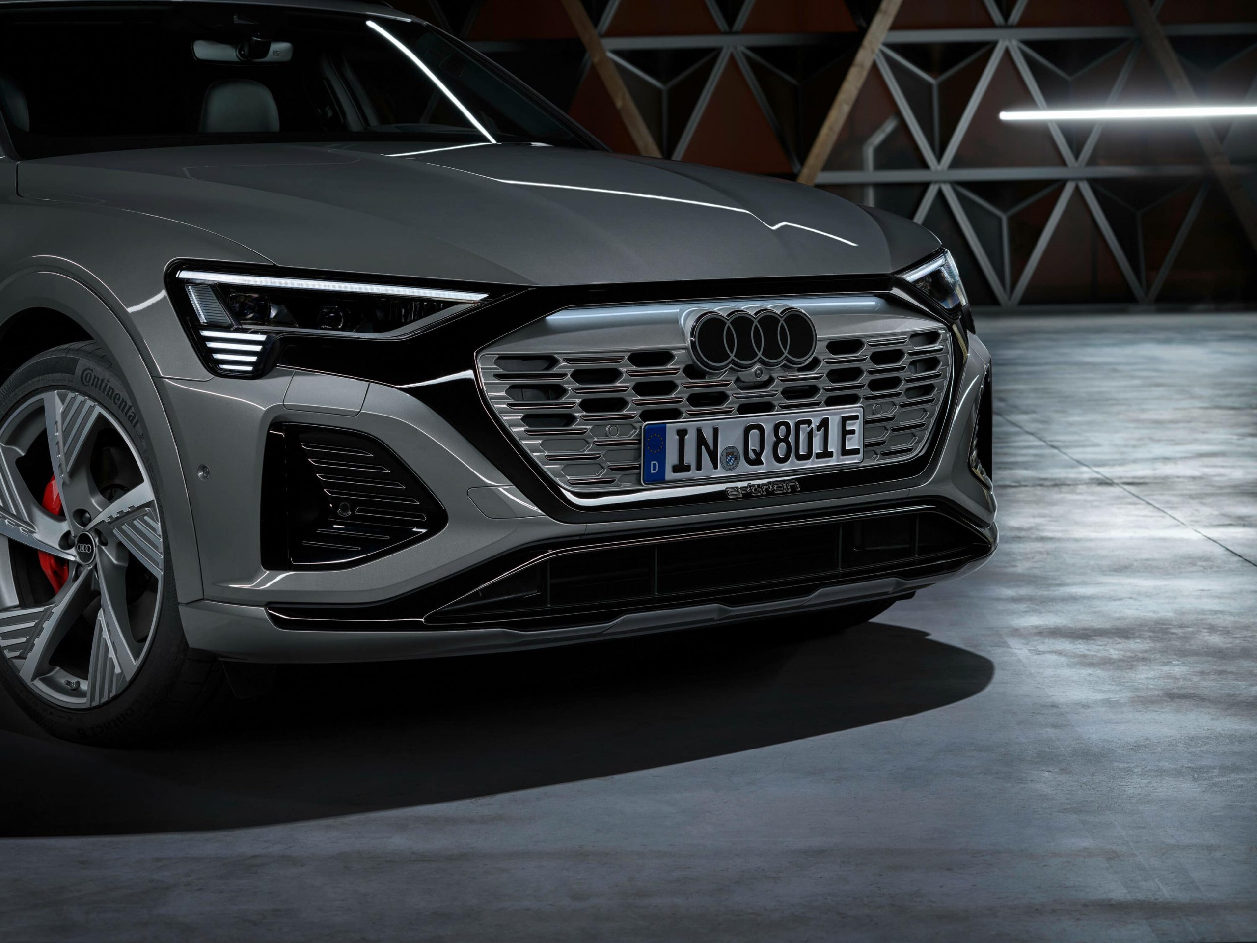
Audi has redesigned its famous four rings logo, ditching the chrome look of its predecessor.
It brings a flatter look than before and a contrasting black-and-white appearance.
The design of the logo also allows it to still look three-dimensional in detail and tie in more closely with the badge that it replaces.
All cars will wear a badge with a thin black border around the four rings, regardless of the car’s exterior colour or grille design. Plus, it’ll be available in solid black as an option on certain models.
Audi designer André Georgi said: “Our philosophy is that every detail must convey a meaning or serve a purpose. On the product, it is – above all, our four rings, unmissable on the front and rear of every Audi model, that make an Audi an Audi. We want our quality to speak through the design and the product itself.
“The new two-dimensional look gives our rings a significantly more modern and even more graphic makeover, although their geometry is almost identical to the former ones.”
These more modern Audi rings design first appeared in 2016 ‘as a consequence of digitalisation’ with this new version taking on a 3D look instead.
Georgi added: “We want the four rings to look the same everywhere in the future: Whether in a magazine, on your smartphone, or a billboard – and on or inside the car.”
Audi says that all new models being built will feature the updated logo, with the new Q8 e-tron electric SUV being one of the first of the firm’s vehicles to wear the new-look badge.

