Vehicle manufacturers have always needed a way to instantly differentiate their products from rivals. While some simply settle for writing their brand names, the majority of manufacturers opt for a logo – often with a meaning behind them which isn’t entirely obvious.
We’ve rounded up ten manufacturers with a subtext behind their logo here.
Audi

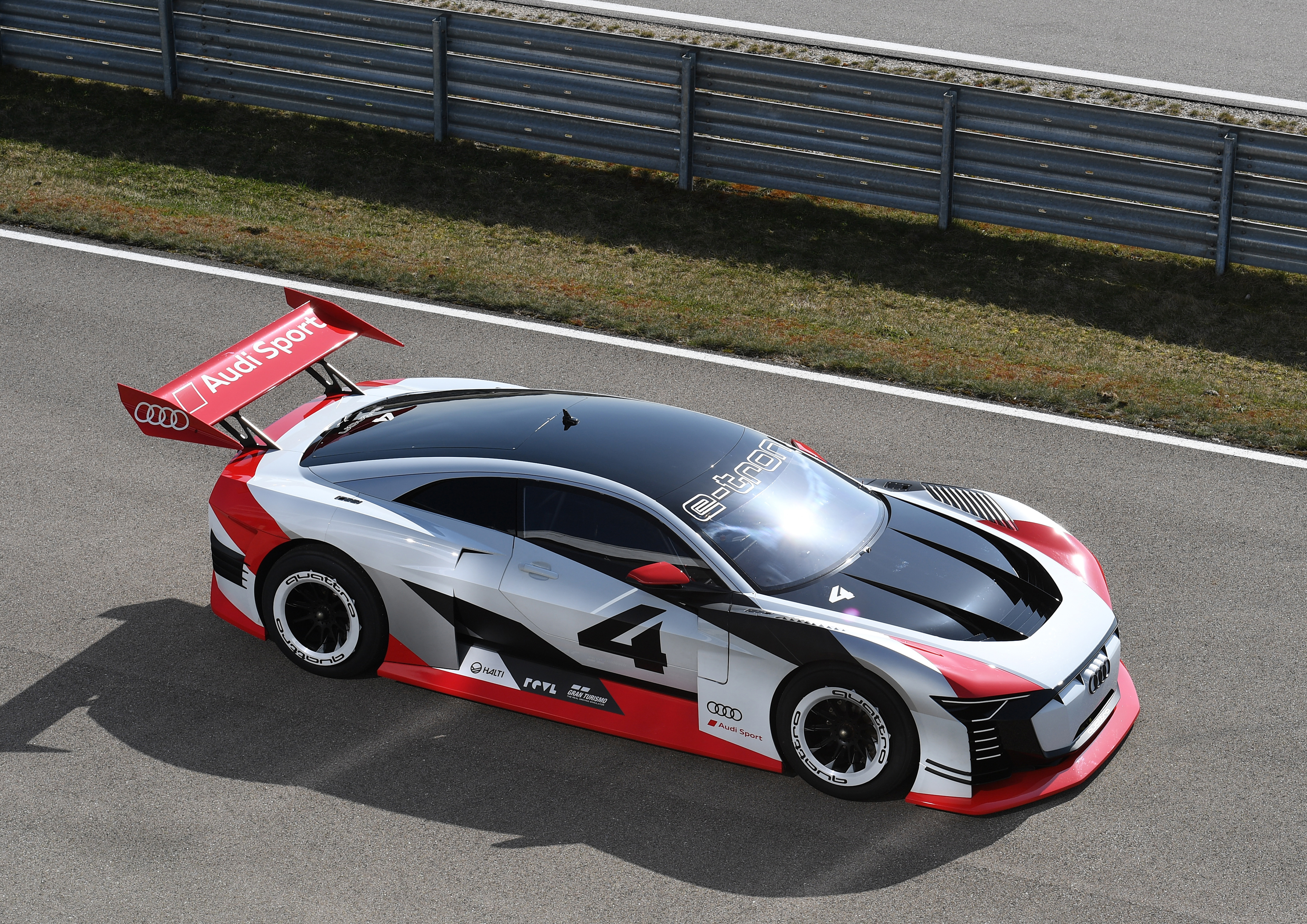
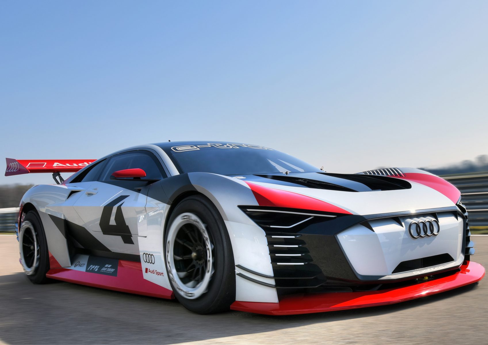
Audi’s four interlocking rings date back to the very origin of the company. The early Audi joined forces with three other brands in 1932 – DKW, Horch, and Wanderer – to create Auto Union, and each ring represents an arm of that company. The brand would later revert to simply calling itself Audi.
Hyundai

Glance at it and Hyundai’s logo looks simply like an italicised H. However, it’s intended to symbolise two people shaking hands and making a deal – not the easiest thing to spot!
BMW
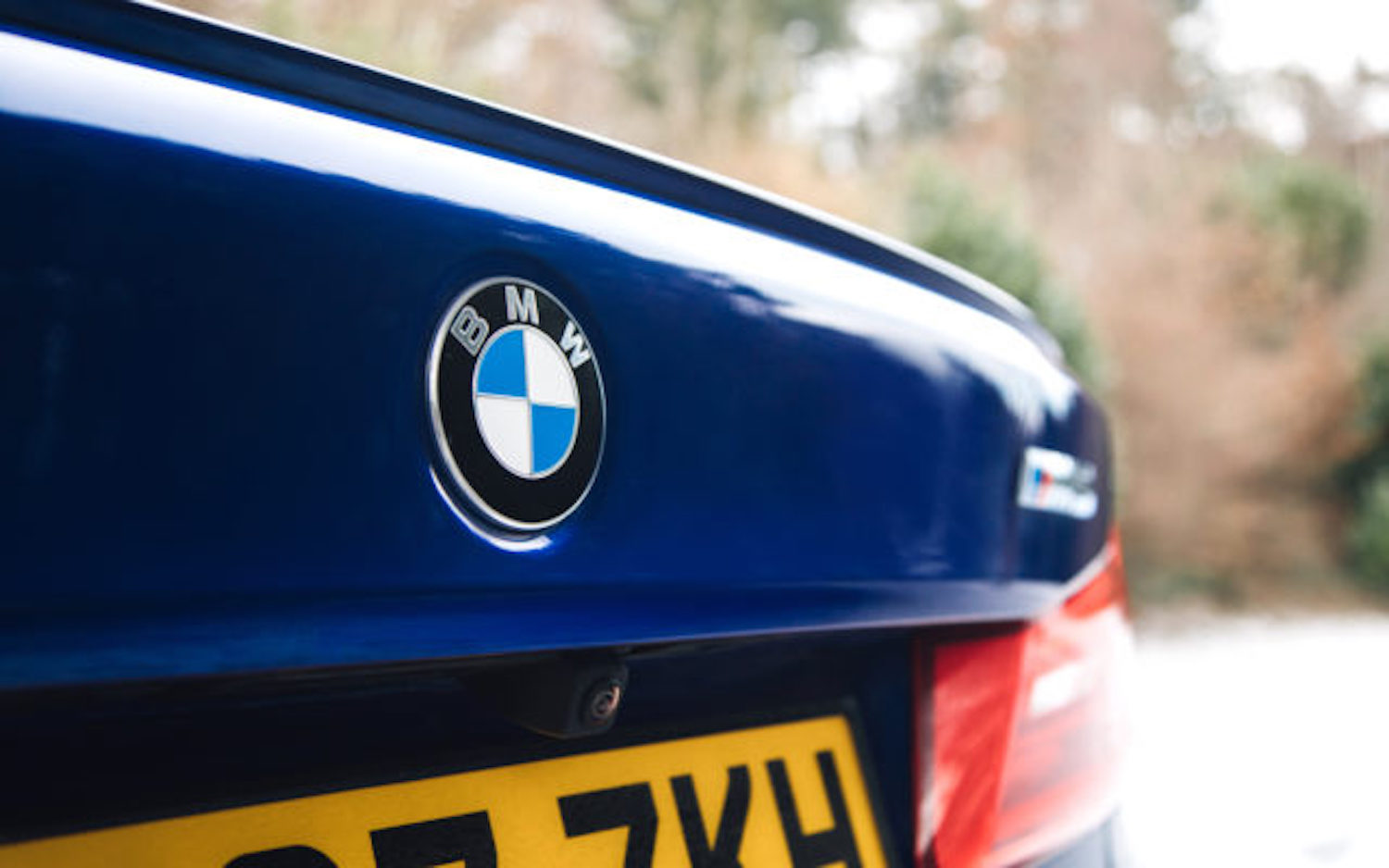
BMW’s logo is commonly said to represent a spinning aircraft propeller, but this likely dates back to a 1929 TV ad showing a plane with the logo superimposed on it. The truth is much simpler – the blue and white represent the colours of the Bavarian Free State. At the time it was illegal to use national symbols in a commercial trademark, so the order was reversed.
Mitsubishi
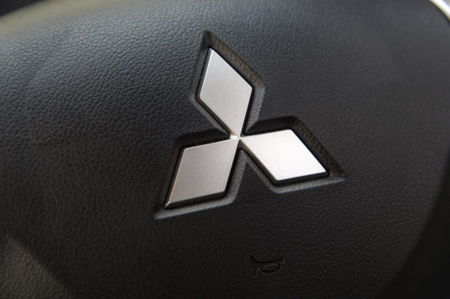
Mitsubishi’s deceptively simple three-pointed emblem is actually the combination of two family crests – Yamauchi and Iwasaki. The name also derives from these – Mitsu, which means three, represents the three oak leaves of the Yamauchi family crest, while bishi means water chestnut, as well as rhombus. The overall shape of the logo is also reminiscent of the founder’s first employer – the three-leaf crest of the Tosa clan.
Alfa Romeo
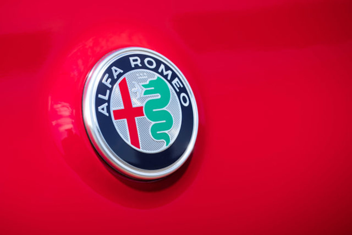
The double-sided Alfa emblem features a red cross on its left side, as the symbol of Milan, and on the right, a snake ‘eating’ a man. This is the symbol of the Visconti family, and dates back to the crusades, when Otone Visconti fought a noble Saracen knight. Beating the knight, he took the symbols from his shield. Alfa Romeo says that the symbol actually shows a man being reborn and renewed from the mouth of the snake, but the flailing arms say otherwise to us.
Ferrari

One of the world’s best-known car logos, the prancing horse emblem first appeared on the plane of WWI pilot Francesco Baracca. Baracca’s mother told Enzo Ferrari that using the horse would bring good luck, and it certainly seems to have done the trick. The yellow background represents the brand’s Modena hometown.
Rolls-Royce
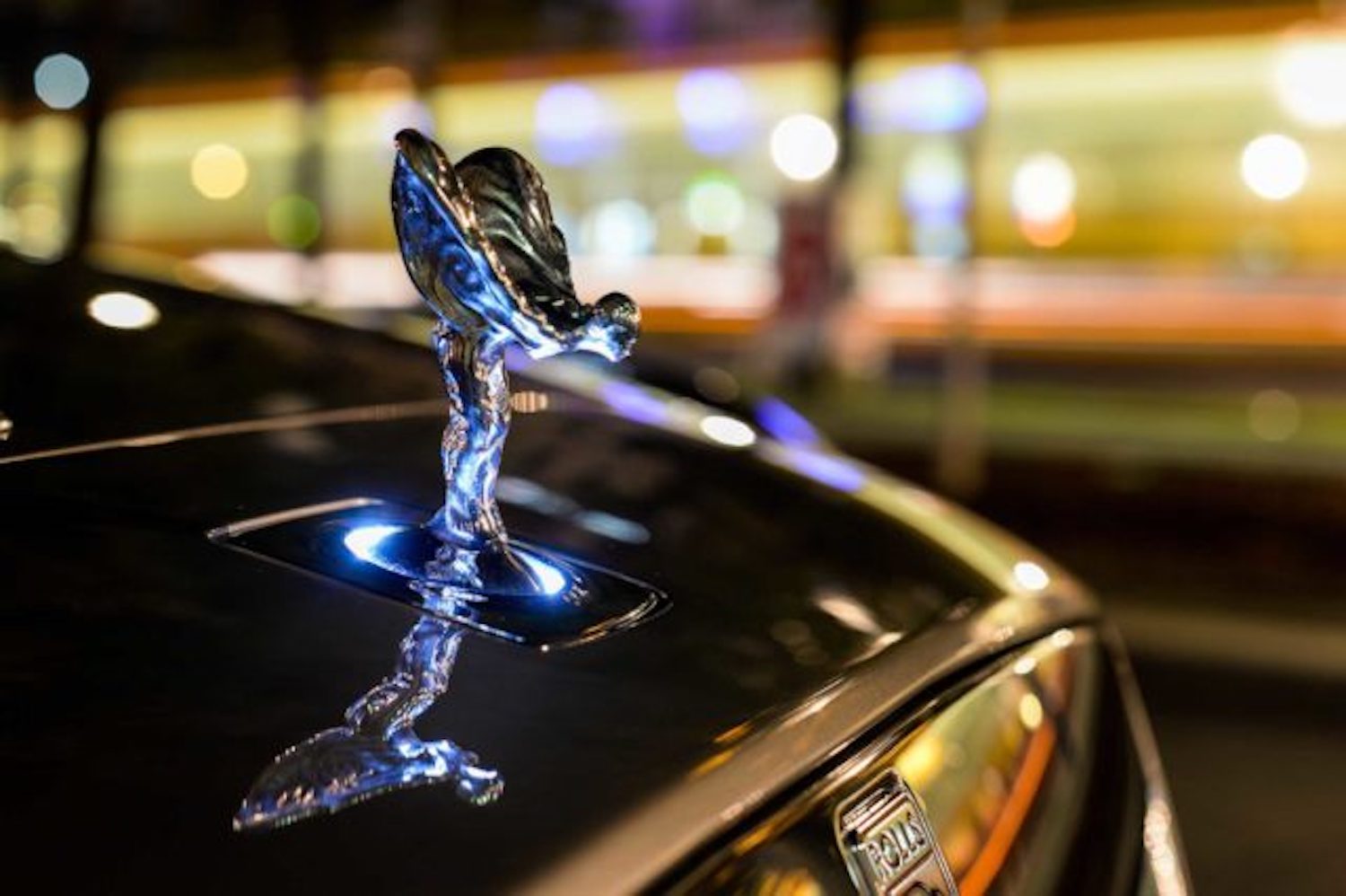
The original ‘Spirit of Ecstasy’ is thought to be actress Eleanor Thornton, who modelled for a sculpture called ‘The Whisperer’. When Lord Montagu of Beaulieu requested a custom logo for his Rolls-Royce, this was the inspiration – and it was such a hit that Rolls-Royce commissioned it for all of its cars.
Porsche

Porsche’s logo is fairly simple – the amalgamation of two coats of arms. It takes elements from the Free State of Württemberg in Western Germany as well as its former capital, Stuttgart.
Mercedes
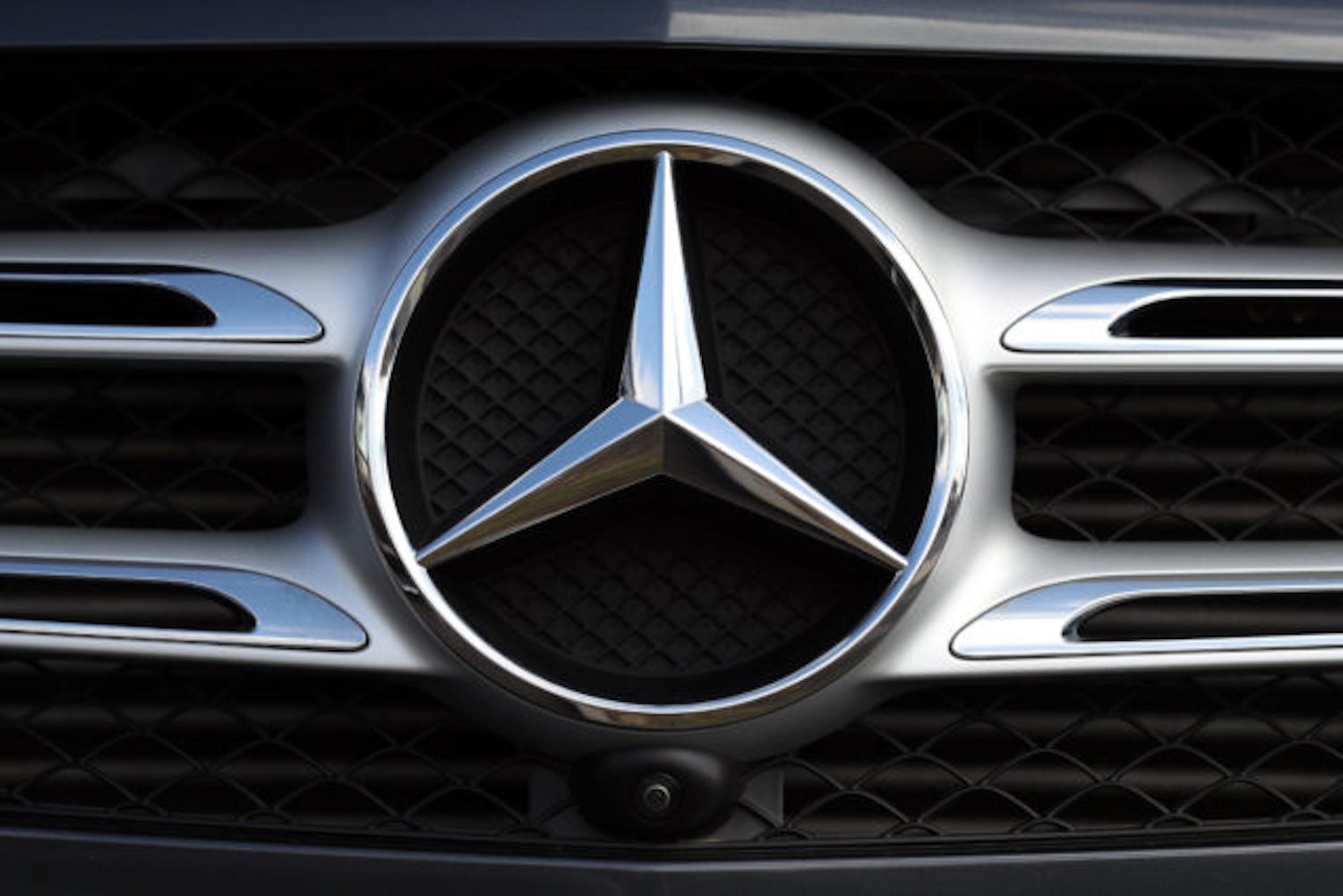
The iconic three-pointed star was created to embody the firm’s desire to establish motorised mastery of the land, sea, and air. That’s right, Mercedes planned for world domination. Scary.
Subaru

Subaru’s six stars represent the Seven Sisters constellation – also known as Pleiades, and called ‘subaru’ in Japanese. They also represent the six companies that merged together to form Subaru’s parent brand – Fuji Heavy Industries.


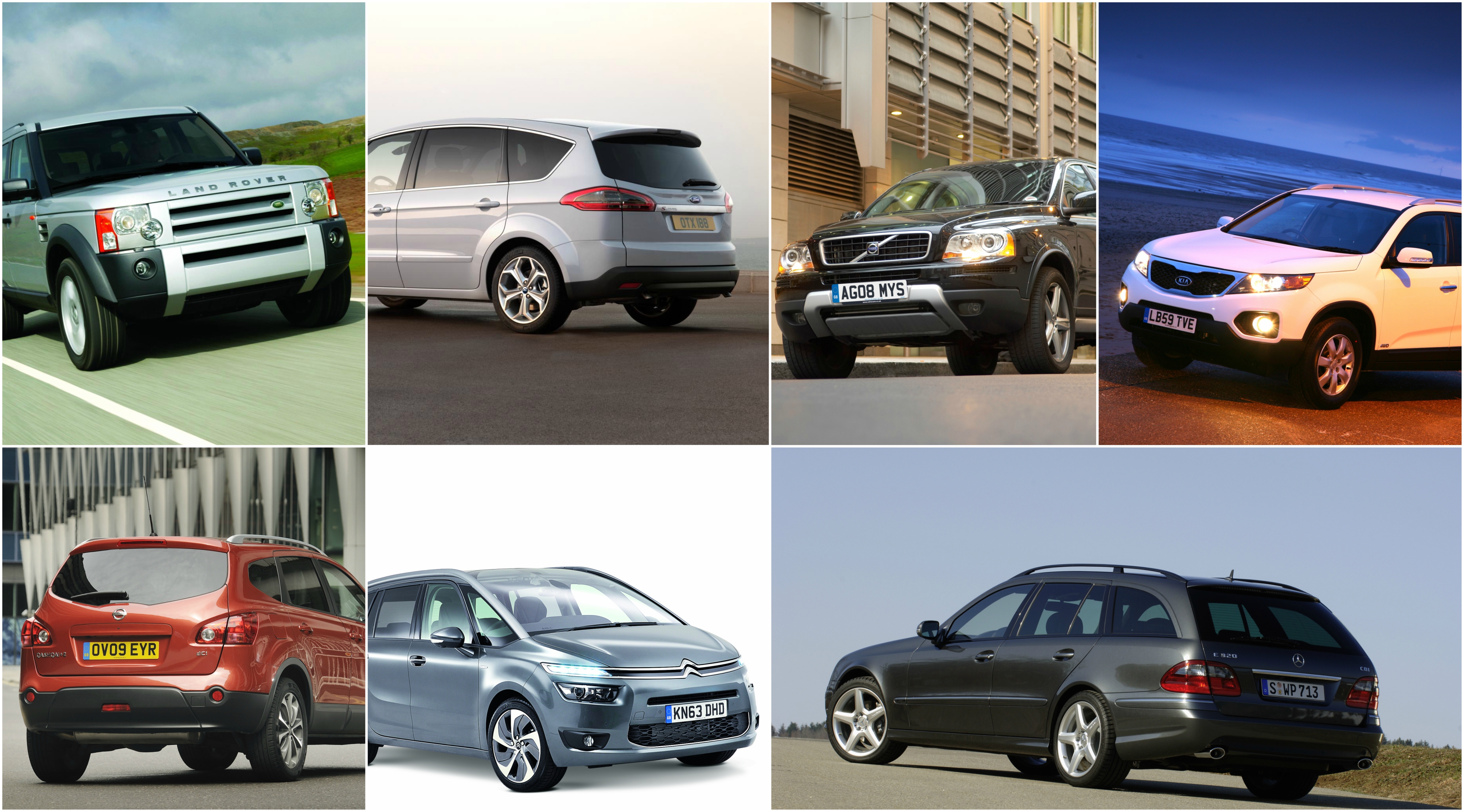
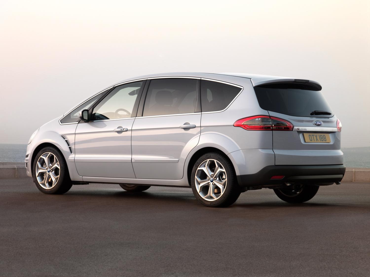


























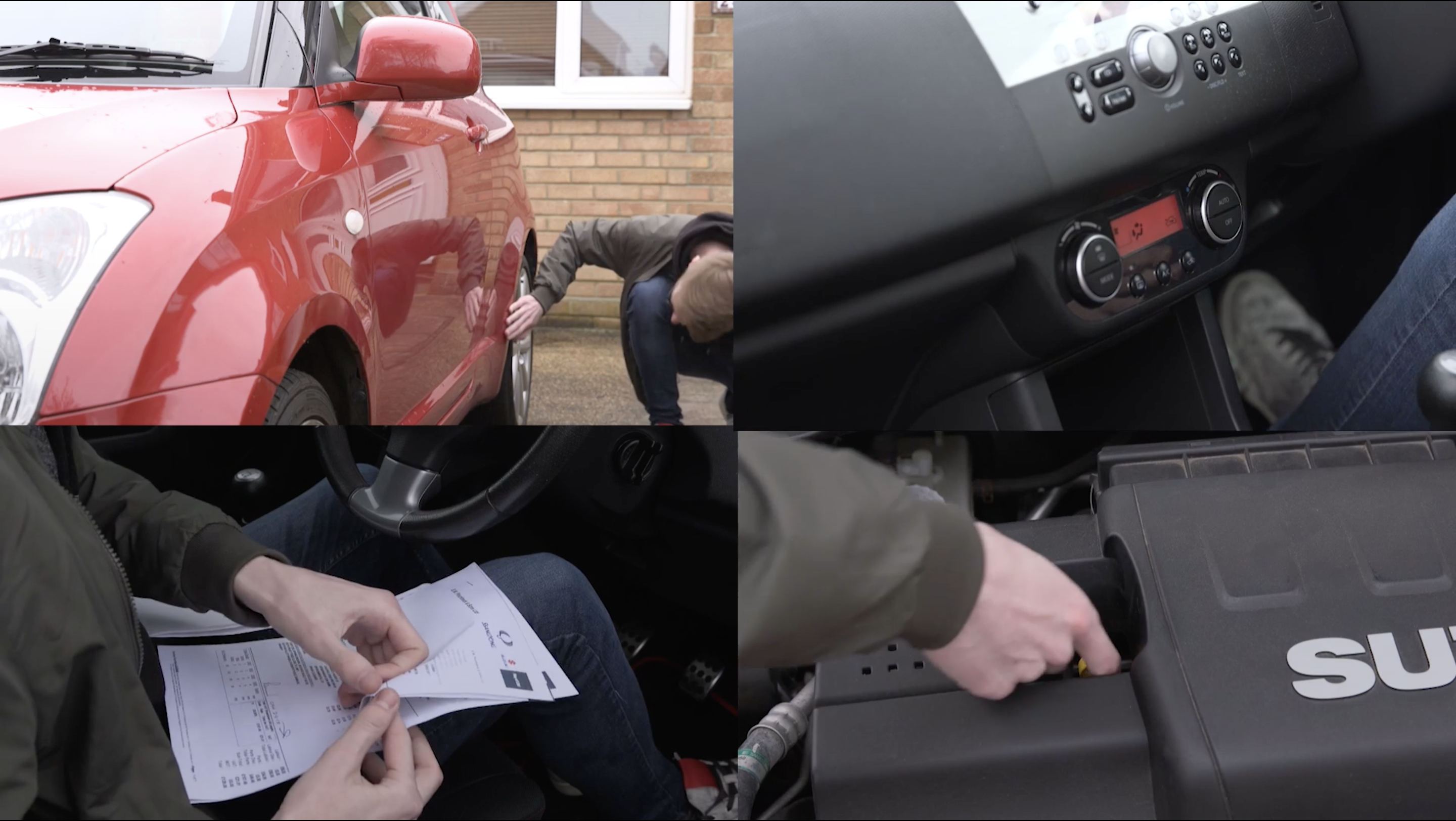

 Before you even go anywhere near the car, give the seller a ring and ask them about it. This could save you hundreds of pounds by eliminating the need to travel and see the car if it isn’t quite right for you.
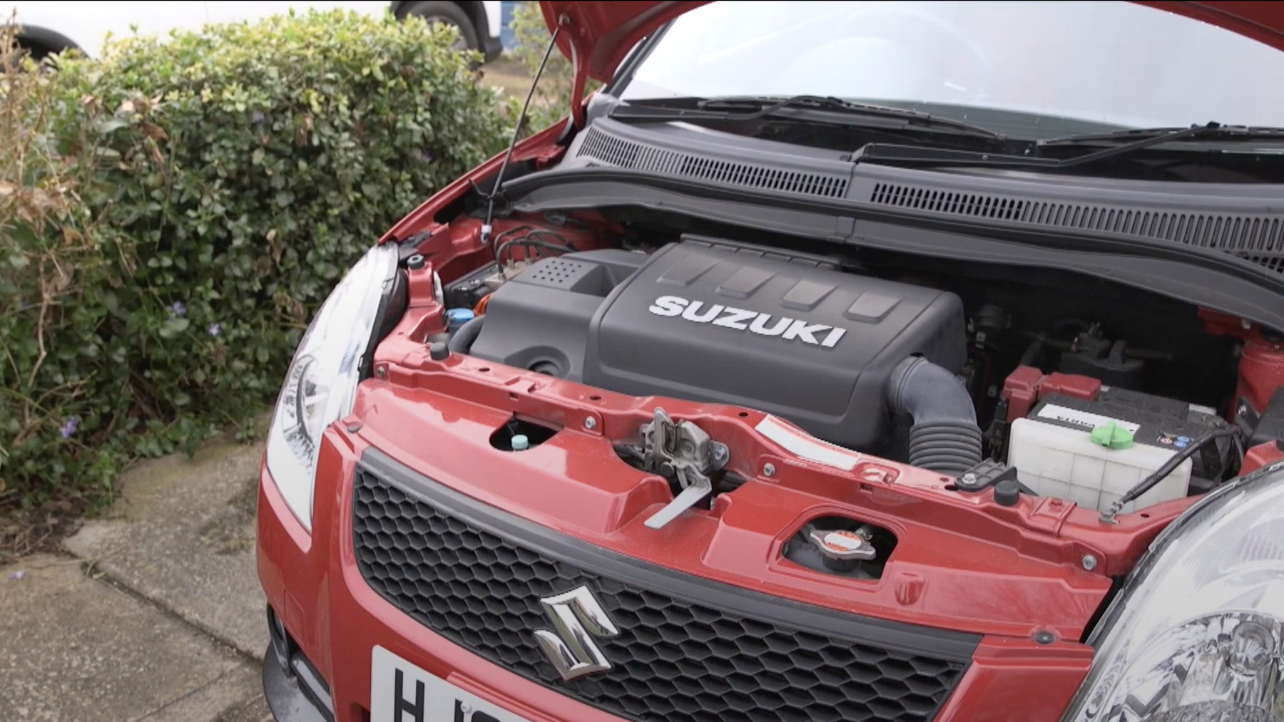
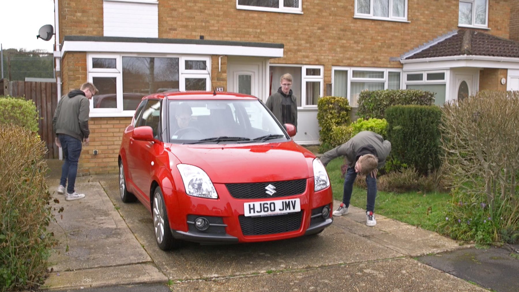 Once you get to the car, it’s time to give a thorough going over. Check that the engine isn’t warm – this could be a sign that the owner is trying to hide some mechanical faults.
 Does the interior of the car match the mileage? If the car has a beaten-up interior but has low miles, it could mean that the vehicle has been ‘clocked’, where the car’s odometer is wound back. This is less prevalent in newer cars, but it’s worth bearing in mind.